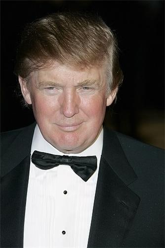
There has been hubbub in Chicago over the appearance of a sign on a local Trump building. Businesses who aren't considering their own POP advertising fully or simply think that it doesn't matter that much or won't resonate beyond the customer base should pay attention: the sign itself can send a very powerful message.
Granted, Trump towers might not be on the same scale as your own business, but the reaction is worth noticing. According to USA Today, locals have reacted very unfavorably to the arrival of The Donald, whose hotel in that city bears his last name in huge, unmissable letters.
One of those who protested against this recent development was Chicago's mayor, Rahm Emanuel, who called the sign "tasteless" and claimed that he would investigate this and attempt to ensure "a situation like this doesn't emerge in the future."
However, the negative reaction, which has been so widespread that it was mocked by Jon Stewart, doesn't seem to be universal. In a letter to the editor of the Chicago Tribune, reader Karl Hanson asserted the point of view that the sign "looks great" and is good for business. So how does one find the right tone with their sign installations?
"Chicago can take a lesson from New York's Time Square, where signage makes NYC the most dynamic city in America," Hanson writes. "Signage expresses pride of ownership and individuality. The more signs a city has, the more it looks like a city has a thriving business community."
Signs can impact on the areas in which they hang, even if they are simply trying to promote a business. When designing custom window graphics, your business might think of similar concerns. It's desirable to help a company declare "pride of ownership" in a positive way.