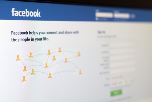
This blog has looked at many different examples of logo changes over the years, minor and major, for brands of different sizes. There are arguably few logos as famous as Facebook's at least in recent years, and like many web-based companies, the social network recently made a change to it that's so subtle some might not notice it at all. Just the same, it may represent an important shift in audience targeting, as Wired's Margaret Rhodes points out.
As she reports, the logo has been slimmed and made more "approachable," specifically with a varied mobile device audience in mind that uses different types of screens to access the Facebook app. To this end, the lettering is now flatter and tidier, with one of the more noticeable changes being a different style for the letter "a."
One of the design professionals that Rhodes spoke to, Howard Belk, said that the alterations are suited to the reality of Facebook's core audience.
"It's a utility driven change, clearly to optimize the logotype for mobile devices, which is really key to Facebook's business strategy," Belk said. "They're recognizing that the overwhelming majority of people see [the site] on a digital backlit screen, and most of those screens are small." While this will affect the way the full name of the company is displayed, the famous lowercase "f" icon will reportedly not be changed.
Branding unity can seem like a major task for businesses of all sizes, especially those who have not worked with professional signage and graphic designers before. Vinyl signs and other materials can bring a campaign to life in a very real way that turns heads and gets you noticed.