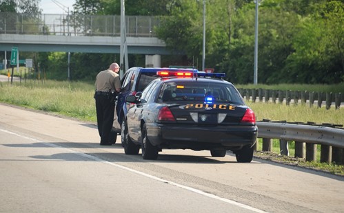
Over time, police departments need to update their vehicles and images to maintain the same degree of authority. This might seem like an elementary process, but there's more at stake than some departments might realize when it's time to change the logo on their official vehicles.
A Texas-based news source, the Marshall News Messenger, recently reported on the efforts of the local police department to bring a new look to its existing patrol cars. The law enforcement agency has opted for a look that, although more expensive than previous designs, emphasizes the logo while enabling it to be seen at night. The word "POLICE" is rendered in large, blue letters across two doors on either side of the vehicle.
Chief Jesus Campa of the Marshall Police Department described to the source his reasons for changing the logo, which reference general principles that make a good police car design work. According to him, the most desirable logos will "pop" at the viewer and grab their attention, even when lighting is dim or the car is far away.
"With police cars, it (the logo) should pop in case you're driving and see a police car in the area, so I figured it was time to change the graphic," he said. In reference to the logo that his department decided on, he said "we did one just to see how it looked, then did another one done with the reflective material and liked the fact that it popped at night."
The color and material of the logo should work with those of the vehicle it will rest on, so that police will be easily recognizable. Truck decals and other design options should be chosen carefully with the aid of professionals.