Great signage can last for years, but sometimes a message needs to be updated to make sure consumers get the right point across. Even if there are other ways for them to get the same information, presenting directions, the name of a business or other important data in a clear manner helps companies put their best foot forward and build up consumer trust.
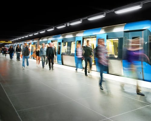
A recent Washington Post column by John Kelly looked at the frustration that public transportation passengers run into when signage is not up-to-date. Some of the factors impacting sign effectiveness he mentions, such as light and visibility, could be relevant in other circumstances as well for anyone that needs to attract attention.
He compares the signage used for the Washington D.C. Metro with the London Underground, the latter of which is more uniform and easier to spot from a distance. In contrast, Kelly says the Metro signs make journeys difficult for travelers.
"The platform information is awful," Kelly says. "There aren't enough signs, and the signs are too small." He adds later that all Metro riders "shouldn't have to march from pylon to pylon to find the surface that has the tiny white stick-on letters indicating the rest of the stations on that line."
Placement is a key part of how visible a sign will be, but before the signs are placed, they can be designed to feature colors and text that will stand out against the background of wherever they are displayed.
Businesses should collaborate with professionals to make custom vinyl signs that match their intentions, satisfy customers and don't get overwhelmed by the rest of the environment. Whether it's large or small, a sign needs to conform with local regulations and be easy to read.