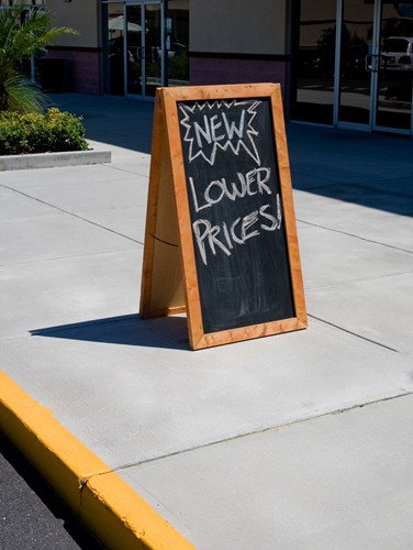
Sometimes, it takes the absence of something to really realize its worth. This can apply to the point-of-sale environment when it comes to the various pieces of signage present. Recently, marketing consultant Chris Petersen wrote for Retail Customer Experience about his time abroad studying the way that a store without understandable signage impacts the user experience.
To clarify, Petersen did encounter plenty of signs, but because he couldn't read them he began to approach each shopping encounter in a different way. He noted that, by not being able to understand the words around him, his attention was drawn more to the immediacy of the products and the present sale.
The lack of comprehension resulted in more customer engagement, not less, at least for Petersen, who argues for less clutter in stores. Perhaps your company can take his words to heart by reducing the amount of signage into fewer but more effective POP advertising pieces.
"The experience changes to what it feels like shopping for clothing or furniture, where it's more about color, style, fit and value," he writes. "Frankly, it's simply hard to describe! No signs or prices changes shopping to be experience based vs. product comparison based."
There's something to be said for putting more effort into individual pieces rather than going overboard with an onslaught of signage. A recent survey performed by FedEx Office found that this might vary for different age groups as well, with more than 60 percent of business owners between 18 and 34 thinking innovation is key when it comes to signs.
The approach that you take to in-store window graphics and other pieces of signage should be consistent with the values you uphold, but also clearly direct consumers.