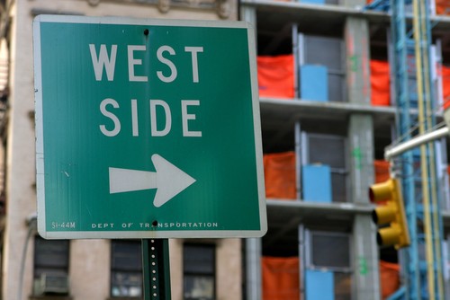
Upgrading a sign doesn't have to mean radically changing it or giving it a complete makeover. While this is sometimes advisable, in other cases, particularly with functional directional signage, the best approach is to keep things simple and familiar, while still updating key graphical elements. Along these lines, former military base and historic site Liberty Station in Port Loma, CA, is welcoming new signs that are simple but effective.
The San Diego Community Newspaper Group reported on the new signs and the thought behind them. While there have been improvements to local buildings, the main mission of the design is to promote the community as a place that feels authentic and in keeping with its past. That means respecting the design choices previously made and avoiding anything too flashy.
The source quotes Nathan Cadieux of real estate group the Corky McMillin Cos., who said among other things that there would be "no neon lights" as part of the initiative. A photograph of the current signage being used shows a navy blue display with white lettering in an easily readable font.
"We really want people to explore Liberty Station, visit the new restaurants, the cultural district, share a meal or a laugh or go on a picnic," Cadieux said at a recent presentation. "We love the idea of Liberty Station becoming a big community asset."
On the other hand, just because a new sign is staying true to the spirit of the old one doesn't mean that creating it will be easy or "by-the-numbers." Custom screen printing techniques can produce signs that are matched to the environment they will be displayed in and feel like a natural extension of a facility's existing style.