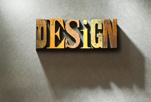
We have talked about how color plays a significant role in every custom print display, but there's another element to consider: the typography of the vinyl banner or custom trade show display. If your company is working on launching a marketing campaign without images, the text accounts for 50 percent of the visual. Even in cases where graphics are involved, one-third of the advertising space is still taken up with text.
Believe it or not, choosing the appropriate typeface, font and size of these texts can make a huge difference. If your marketing display is hard to read, the chances of getting that passerby or prospective visitor to enter the establishment are slim to none.
"Choose a typeface that keeps your text both legible and readable," Entrepreneur Magazine author Ankit Oberoi writes. "One way to do it is by picking a typeface that has large counters."
Before finalizing your business' next batch of marketing tools, consider the size of the display. This may be a surprise to you, but many marketers fail to remember that the size of the text has to change based on the location of the banner. For example, if the poster is written in a block font and bold typeface, it will barely be readable up-close. This display would be the most effective along a major highway, not in front of a restaurant.
Another aspect to keep in mind is the specific typeface that should be used. Often times, businesses use typefaces that they think are esthetically pleasing, but don't consider how they will be used. Marketers tend to use a small collection of fonts because not every style applies to its goal of grabbing a person's attention while also being easy on the eyes.