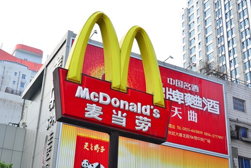
If you have a truly great idea for a logo or business sign, then the language that accompanies it could be almost secondary. Writing for AdWeek, Alfred Maskeroni comes to this very conclusion when considering a project from the Turkish artist Mehmet Gozetlik. Gozetlik has created several designs that adapt popular business logos into neon sign-style images that feature Chinese characters.
For the consumer only used to seeing the English versions of many of these logos, it's an interesting exercise to look at them with fresh eyes and see how much the design itself can represent each brand.
Some, like Shell or Chiquita Banana, feature images that are so detailed they are easy to recognize no matter what the medium. Others, like the Levi's Jeans logo, are so simple that it could take those who don't read Chinese a few moments of consideration to figure out which brand it is supposed to represent.
Commenting on the effectiveness of this project, Maskeroni says that these images work as "a true testament to the indelible impression these logos have in our minds."
"Instead of simply translating the brand names into Chinese, the logos include a generic description of the product written in Chinese," he writes. "So, even for those fluent in Chinese, the logos appear somewhat unbranded."
This shows the power of truly well-crafted and created business branding, which can reach beyond language barriers and be universally applicable if treated correctly. Working with a custom screen printing provider, companies will have help displaying their logos in a way that resonates with the greatest number of people. This art series could also give store owners an idea of how to use language in their signs so they don't drive away those who aren't able to read it.