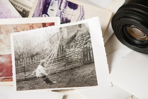
Companies can give their employees business cards that are simple in many different ways, and one tactic is to use visual elements strategically. In a recent article on the photography site F-stoppers, Adam Ottke warns against putting images from photos on business cards. While his reasons have to do with photographer business cards specifically, some of them can also apply to other professions.
For example, Ottke says that the proliferation of cards with photos on them has made them somewhat predictable, and that photos that are meant to be displayed in large prints might not have the same impact when translated to the back of a card. Professional photographers can be especially hindered by this, since they are basing their livelihoods around interesting possible customers in their work.
One of Ottke's most salient points, though, regards the way that photos can ruin the "air of mystery" that accompanies the card, especially when it just says "photographer".
"When we finally get to the point at which we feel comfortable putting those lovely 12 letters up, some of us choose to destroy any level of mystery and romance associated with this term of endearment with a photograph on the reverse side," he writes. "Stop it. Let the word sit there and hang in the air."
Depending on what job the cardholder has, similarly withholding information can be an effective tactic for getting the viewer interested. The highest priority for a business card should be making the name and company information stand out, and by reducing visual clutter this will be more evident on a first glance.
With advice from professional graphic designers, businesses will be able to have the same support in creating different pieces of signage, whether in small spaces or larger pieces through custom screen printing.