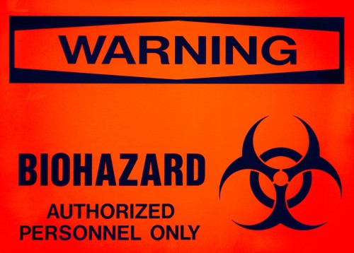
Restaurants and other establishments need to convey important information through POP signs, and sometimes this data pertains to delicate health matters. The way you broach sensitive topics through POP advertising reflects on your business and impacts the impression you leave on customers.
NPR recently profiled an Ebola virus awareness campaign in Sierra Leone that uses intense imagery to educate onlookers. Those unfamiliar with the reality of the disease may be surprised by how vividly the posters show the various negative effects of the virus.
Since hundreds of people are thought to have been infected in Sierra Leone this year, the Kick Back Ebola initiative has a strong sense of national urgency. The source spoke with local Dr. Amadu Sesay of Freetown, who described how these posters were designed specifically to appeal to the local populace.
"They are so graphic because you have to be mindful of the environment we live in," Dr. Sesay says. "Not many people are literate in this country. Therefore, most of the information we want to disseminate out there, to the general public, we have to have graphic pictures, to get the message out. And, of course, for emphasis."
The poster also shows means of treatment and prevention, encouraging onlookers to avoid eating certain meats that may be contaminated and to wash their hands.
POP signs that have a specific tie to your business should similarly use words and images to make the best impression on customers. If there's a warning that ties to the service you provide, you can emphasize that. Any combination of elements needs to be well-designed and easy to read.