Businesses with brick-and-mortar locations need to find the signage pieces that are going to have the greatest impact in their particular venue, and that involves making some careful decisions. Which section of a building is most visible from the outside? What will visitors see as soon as they walk through the door? How large are the store's windows?
If they are designed to specifically match the environment of a particular store, new sign pieces will be more likely to stay in the customer's mind and give them a positive association with the establishment. Each surface comes with its own additional pros and cons that businesses need to think over as well.
For example, in most cases the walls inside a store will have a distinct color or pattern, which means that graphics printed for them have to match. Even if the wall color is light or neutral, it needs to factor into the kind of image that will be placed on top. Signs that clash with the wall they are placed on could confuse viewers or discourage them from looking.
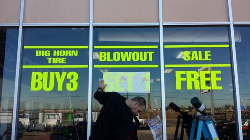
While window graphics don't have this problem, they also need to fit their surroundings. Well-designed graphics and logos for this space will stand out to any person walking by. More strongly affixed to your building than a fabric sign might be, window imagery makes it easy to appeal to a person immediately, getting them interested. High quality best graphic options should display important, fundamental information about a business in a way that is bright and holds the onlooker's attention.
Pressure Sensitive Products has extensive experience applying graphics to different surfaces and can help you find the right one. Send us an inquiry to get information on a free consultation for your job.